The purpose of this page is to show, by example, CSS tricks that I've learned. This page is a work in progress. The official W3C CSS page formerly linked to Dave Raggett's intro to CSS directly, but for some reason it doesn't anymore, so there's the link. You'll want to bookmark the W3C's table of CSS 2.1 properties if you haven't already; it's what I use as my main CSS reference.
Here's an example:
<style type="text/css">
  body { color: black; background: white; }
</style>
That goes inside the HTML document's <head> section.
A link to an external style sheet also goes inside the <head> section. Here's an example:
<link type="text/css" rel="stylesheet" href="style.css">
The href="" attribute has the URL of the stylesheet, of course.
/* A comment in a CSS page looks like this. */
By default an HTML link has a different color and is underlined, and if the link has been visited before, then it's a slightly different color than a link that hasn't been visited. CSS gives the web page designer control over the appearance of links. An easy way to make a web page look more sophisticated is to remove the underline from links, although I like to keep the underline when the mouse is on a link, so the page visitor can tell two adjacent links apart.
CSS defines several "pseudo-classes" for links. :link is for a link that hasn't been visited yet. :visited is for links that have been visited before. :hover is for links that the mouse or other pointer is currently on. :active is for a link that is being clicked: the mouse button has been clicked but not yet released. :focus is for links that currently have the focus; this is mainly useful for people navigating the page with something other than a mouse.
Here's an example that removes the underline from links except when the mouse is on them, and also sets custom colors for links.
a:link, a:active
{
	color: #0099ff;
	text-decoration: none;
}

a:hover
{
	color: #0099ff;
	text-decoration: underline; /* underline links when the mouse is over them */
}

a:visited
{
	color: #0066ff;
	text-decoration: none;
}
Suppose we want to put a half an em between the elements of a numbered list. Here's an example:
li { padding-bottom: 0.5em }
Sometimes it's very tempting to center a <div> by throwing the attribute align="center" into the HTML, which is a deprecated method. The W3C naturally recommend CSS be used instead. The CSS formatting model makes that method not as simple as I would like.
The W3C recommend that the CSS style text-align:center be used instead. That advice leads the reader down the primrose path. The problem is that text-align:center centers the text within the <div>, but the <div> is only as wide as it needs to be, so it doesn't do anything!
For example, let's see if we can center some text in a <div> in an otherwise empty part of a page. The border of the <div> has been colored so that we can see it.
<div style="border:solid blue;width:10em;margin-left:auto;margin-right:auto;text-align:center;">Center this</div>
The width of the block has been set manually. That allows the margin-left:auto; margin-right:auto; to center the <div> inside the containing block (the page). Then text-align:center; centers the text within the <div>, because the <div> is wider than it needs to be.
I tried not setting the width of the <div> manually; that didn't work. To add insult to injury, the correct method didn't work in the Design view of Visual Studio 2003, or in Internet Exploder; I had to view the page in Opera to verify that I was using the correct method. HTML isn't always easy! Sorry, but I don't know how to fix it in IE...
I just learned a little trick from this page by Bert Bos, who has a knack for explaining tricky CSS things. It's fairly simple to center an image, it turns out: first change it to a block-style element with "display: block", and then apply the "margin-left: auto" and "margin-right: auto" trick.
Floats are actually pretty easy to do, but for some reason I forget how from one document to the next, so I'm documenting it here now. One object floats, and one doesn't. The part that is confusing is that the text that flows around the picture isn't what floats, it's the picture that floats. Somehow that seems backwards.
Here's how to do it, using the example of text flowing around a fixed-width block:Got it? Good. Time for an example.
<div style="width:5em; margin:2em; float:left;
border:solid red; text-align:center">This block floats.</div>
<p>Floats are actually pretty easy to do...</p>
There's one more thing to mention, and that is that the only way I know to make a block-style element not expand horizontally to fill all the available space is to make the block float. I've done that for all the examples in this document, because otherwise the yellow background goes all the way to the right of the page, which is distracting. Unfortunately one must remember to use the clear:left style for the very next block element, or else the float wrecks the page layout. Maybe in a future revision of CSS there will be a CSS property that gives a block element the minimum width rather than the maximum width.
The W3C say to not use <table> for formatting, and I agree with them. Tables are for tabular data. I feel sorry for blind people trying to navigate web pages that use tables for formatting. If the web page uses divs and spans, then the browser knows that all that stuff is just formatting to line things up right, and therefore it knows how to ignore the formatting and go straight to the content for the blind users.
Here's an example that doesn't work very well:
<div>
  <span style="border:red solid">Here is<br>one span.</span>
  <span style="border:blue solid">Here is<br>another span.</span>
</div>
What gives? By way of explanation, here's an example that does something closer to what we want:
<div>
  <span style="border:red solid; width:10em; float:left">Here is<br>
  one span.</span>
  <span style="border:blue solid; width:10em; float:left">Here is<br>
  another span.</span>
  </div>
  <p style="clear:left">As you can see...
As you can see, this works more like what we had in mind. The key was to set the width of the span. To get the trick to work in Opera, I had to make each span have the "float:left" style, and the following paragraph had to have the "clear:left" style. This must be one part of HTML where standards compliance is poor. You will need to experiment.

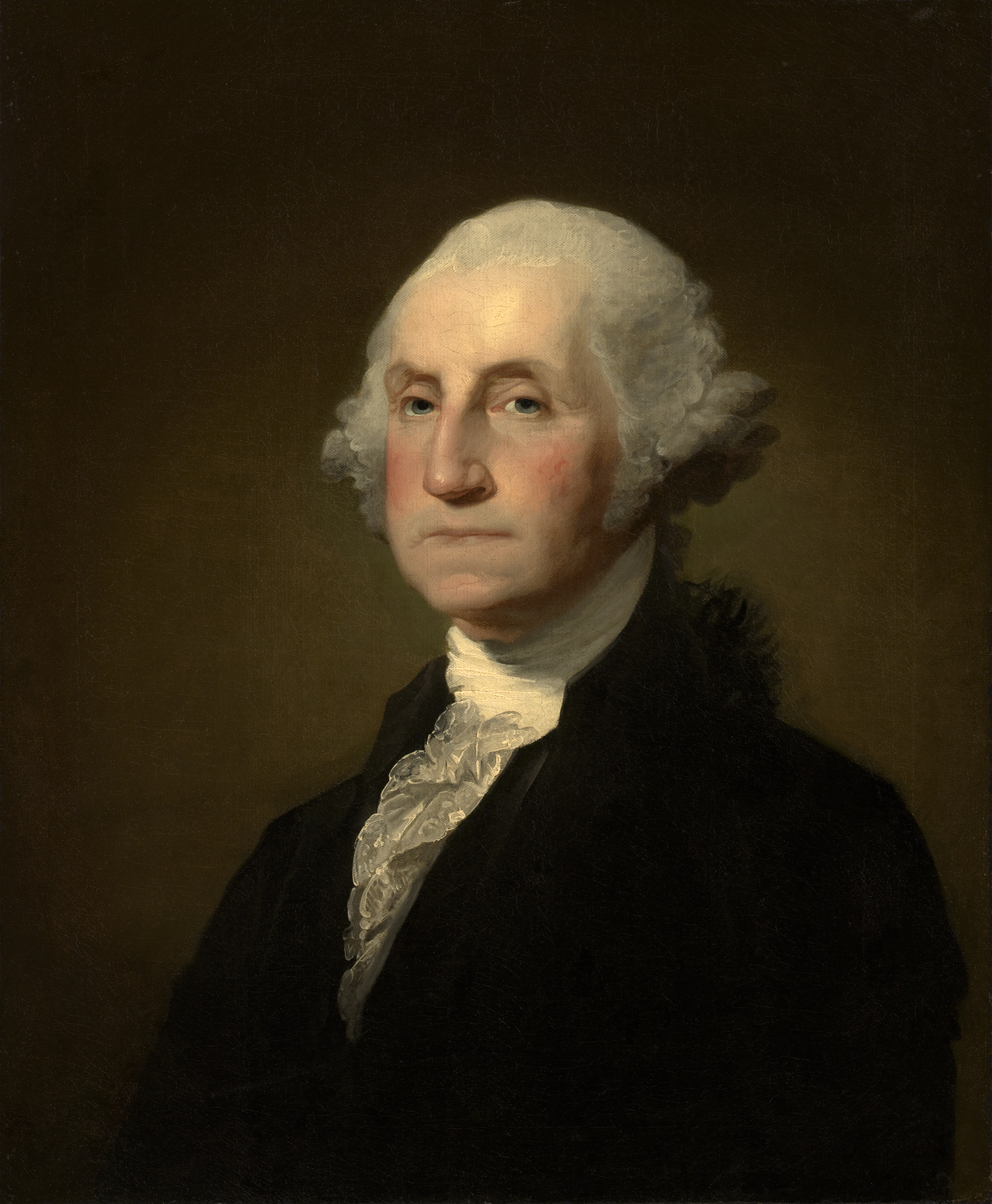
Unfortunately there's no good way to do this; the best way seems to be a <div> containing the picture and another <div> with the caption, like this:
<div style="float:right; margin:1em">
    <img src="http://upload.wikimedia.org/..."
    alt="George Washington" width="220" height="263">
    <div style="text-align:center; font-style:italic">George Washington</div>
</div>